 Red over at Reds' Corps was asking about creating army shots like you see in Forge World publications. I used the enthusiasm generated to try putting together a very quick piece as a reminder to myself of all of the different tools that I tend to use, as well as the process that I go about. It should be said that Photoshop is so versatile that there are literally dozens of different ways to do one thing! Using a recent picture of my commander I decided to try my hand at putting him into a desert background. This isn't a step by step guide, but I will highlight a few useful tools.
Rather than cutting out the model, I tend to delete the background. This is a subtle difference, but allows me to create more natural blurred edges. I used combinations of the Quick Selection and Erase tools. With a range of different Default Brushes in terms of their size and edge. Using smaller size brushes lets you get into the finer folds, larger brushes with feathered edges lets you create more blur, which will come into effect once the model is placed in its new setting.
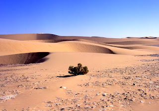
 This picture was pinched from the Interwebs, courtesy of R.Pelisson from www.saharamet.com. Using this as the Background Layer, the Commander was pasted in as a separete layer. Some Colour & Lighting Adjustments were made to the background to help the model blend in and mute down the vivid image. This isn't a holiday brochure!
I also added a shadow for the Commander on yet another Layer, using the bush as a guide for the light source and shadow length. This helps cement the model into the image. As the background image has a wide Field of Vision (focus runs deep into the image) I also decided to use the Blur tool to set some of the background out of focus. The result?
Well, not 100% perfect, but not bad for about one hour twiddling! Self criticism is always important, and things that would definately need improving are the rock to the rear of the Commander as well as the general scale of the chap himself... a bit smaller might help him fit better - though its always difficult to get the true sense of scale without any other references. Once the base picture was done, I tried out some of the Filters. Adding Noise to the image and some Artistic effects as well as changing the colour levels again. I also used another source image from my computer, this time of an old paper, and overlayed this as a new Layer. I adjusted the Opacity so that it was almost transparent, giving the effect of a very old photograph.
As there are literally dozens of different ways to do one thing, the best advice is always to experiement using different tools and brushes etc. Combine different things to see what effects you can get and remember to use Layers!
More!?


No comments:
Post a Comment